Design Process
Market Trend
Food Delivery:
Restaurant delivery has grown 20% in the last five years; while estimates differ, online food delivery sales are estimated to grow as high as $220 billion by 2023 – 40% of total restaurant sales.
Uber eats case study
Scope & Focus
For the project, I am creating a better structure of user experience & user interface process to help users select the perfect restaurant based on their preferences. First, I decided to optimize the usability of Uber Eats by removing repetitive and unnecessary steps to the restaurant listing page. Second, I added comment features to the restaurants.
Problem Statement
Uber Eats showcases too many options to navigate restaurants & menus, causing users to have lousy accessibility to pick the proper Restaurant & Food based on their personal preferences.
Delivery Methods:
Increased third-party delivery (Targeting Group)
In-house restaurant delivery fleets
Prioritizing delivery data tracking
Competitor Analysis
Competitor Feature Analysis:
For a better understanding of the food delivery market, I researched some top companies, including (DoorDash, Postmates, Grubhub, HungryPanda, and Chowbus), while listing the features they have and do not have.
Observation Map
Current User Flow
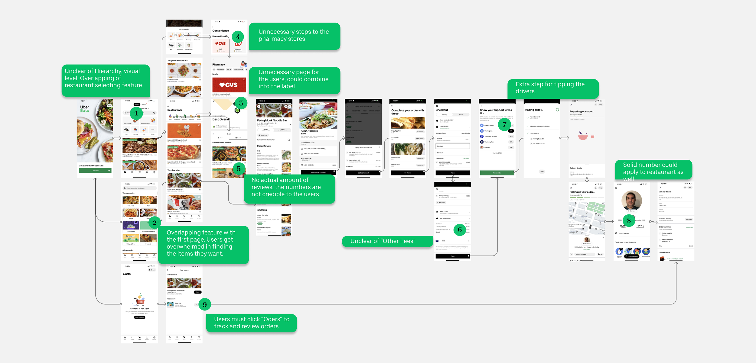
To have a better understanding of the Uber Eats process. I ordered the food using Uber Eats and experienced the entire process, including logging in to uber eats, Browsing the food list, Going through the UI design of Uber Eats, Ordering the restaurant & food, Paying the bill, and Pick-up the food from the driver.
After going through the process, I made the current user flow of Uber Eats while discovering the problems from a standing End-User perspective.
Insights
Takeaway
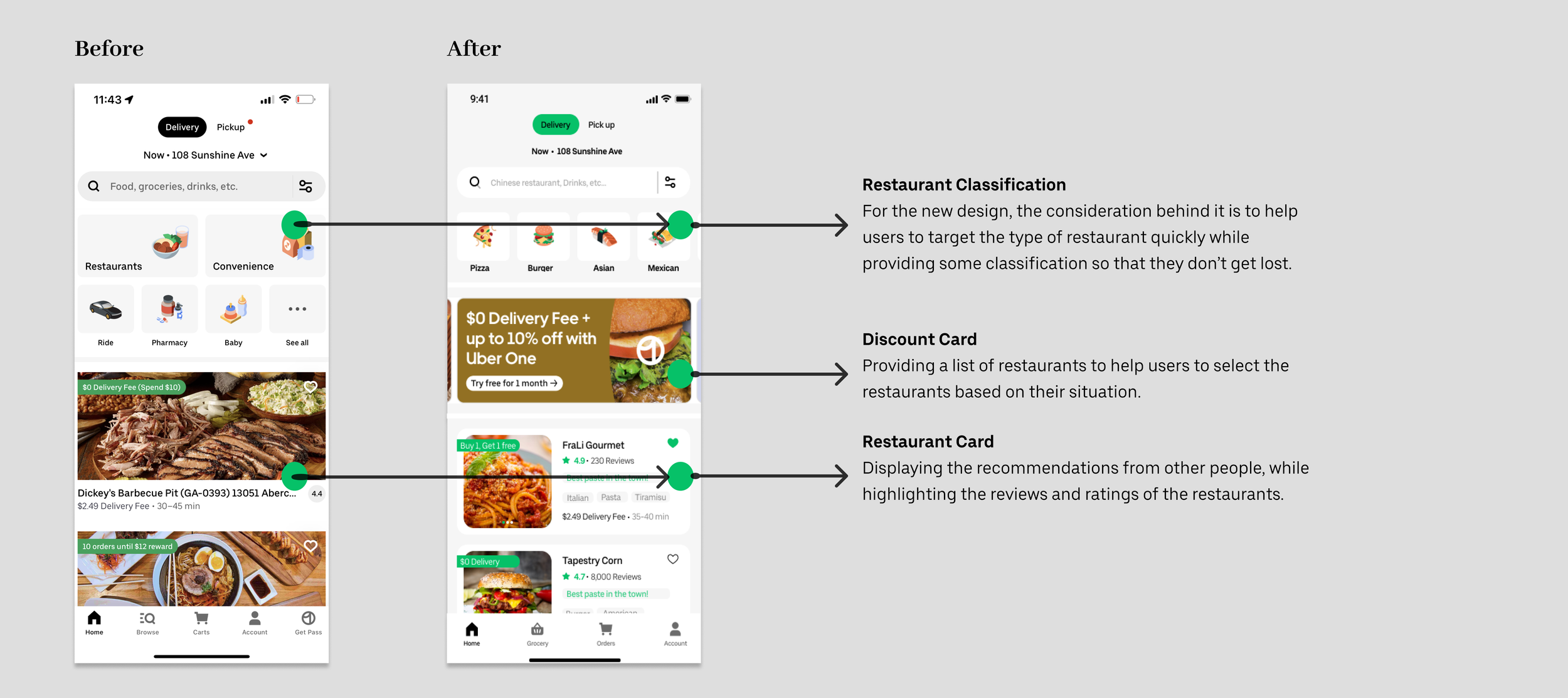
Unbalanced navigation for the first page, causing users hard to locate the proper page.
Too many unnecessary steps in user interface design. Potentially could be combined into labels.
Too many options for the users, causing users to feel overwhelmed and have difficulty making decisions.
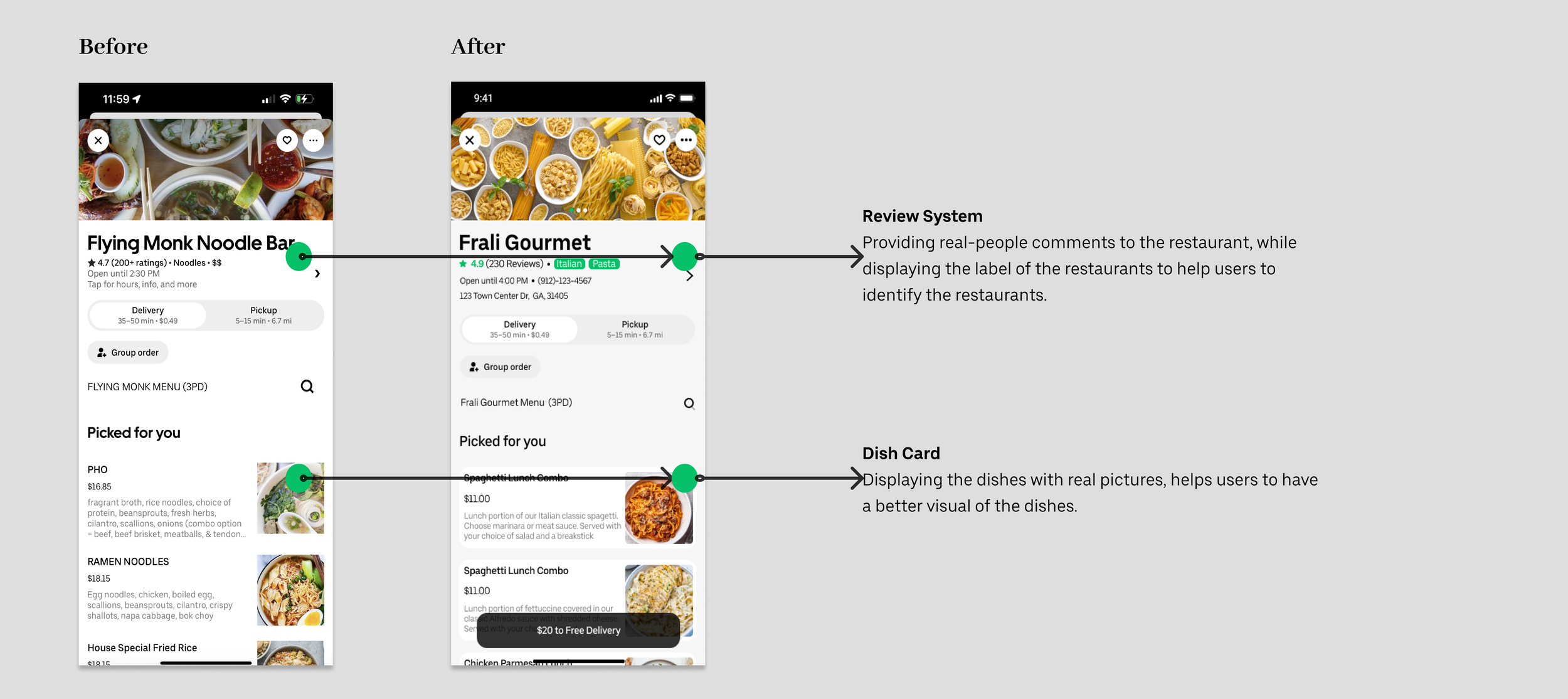
The “Fake” rating system of restaurants does not build a trusting connection between the users.
There is no ”Feedback” from the restaurant or other people.
Unclear the payment system, causing users to feel like being “double charged”.
The navigation of carts does not show the orders on the first page. Users must click orders to track the current orders.
Primary Research
Memory Basin & Interview
Once I had the Competitor Analysis and Observation Map, I decided to dig deeper. I conducted 5 users for the Memory Basin & interviews between the age of 20-35 years old. Their professions range from students, designers, business, and doctors, and they have very different levels of experience in Uber Eats.
Interview Result
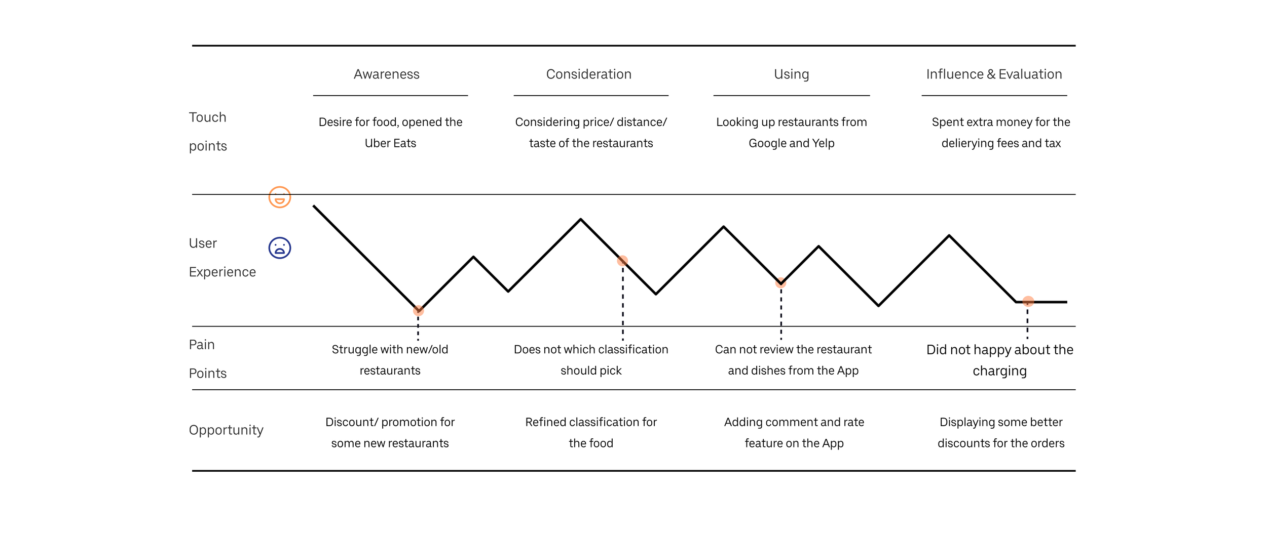
80% of participants noticed that the restaurant system rating was not meeting their desire. They are back and forth between Uber Eats and, Yelp & Google Maps to select the perfect restaurant.
80% of participants are not happy with the menu visualization system. Uber Eats uses the same images for all dishes, causing users to be disguised.
60% of participants didn’t know how to apply the discount and never used the discount to the order.
80% of participants never use Convenience & Pharmacy & Ride on Uber Eats.
Insights
Affinitization Map
In order to summarize the key findings from the primary research, I applied an affinitization map to refine the actual desires of the users.
- Users can not find perfect restaurants
- Users can not look up restaurant reviews
- Users can not look at the real dish’s pictures
User Journey
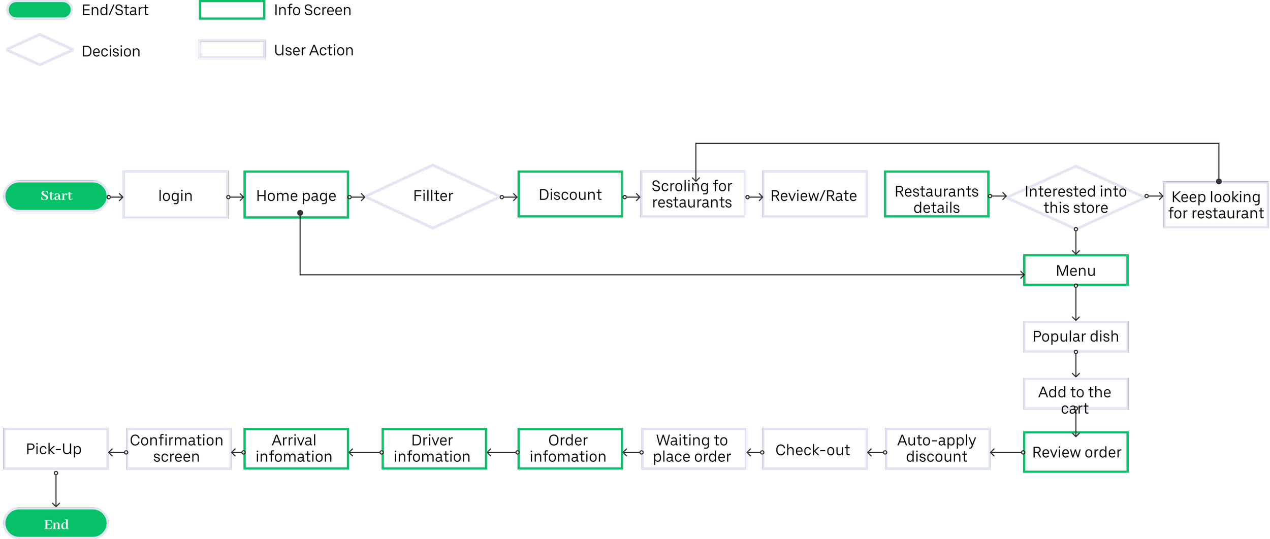
User Flow
Information Architecture
Wireframing
Sketch rapid wireframing
High-Fidelity Wireframes
Prototype
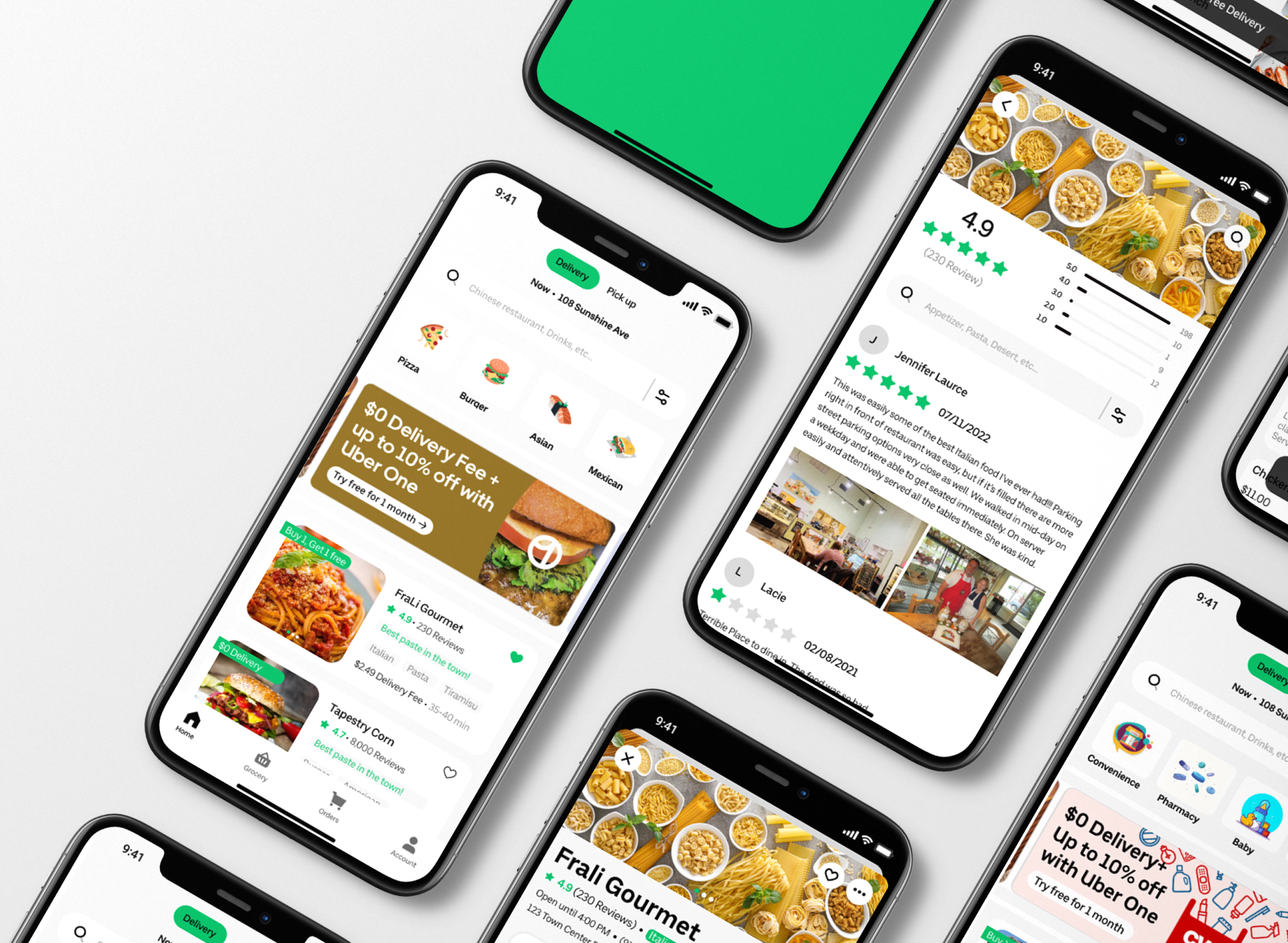
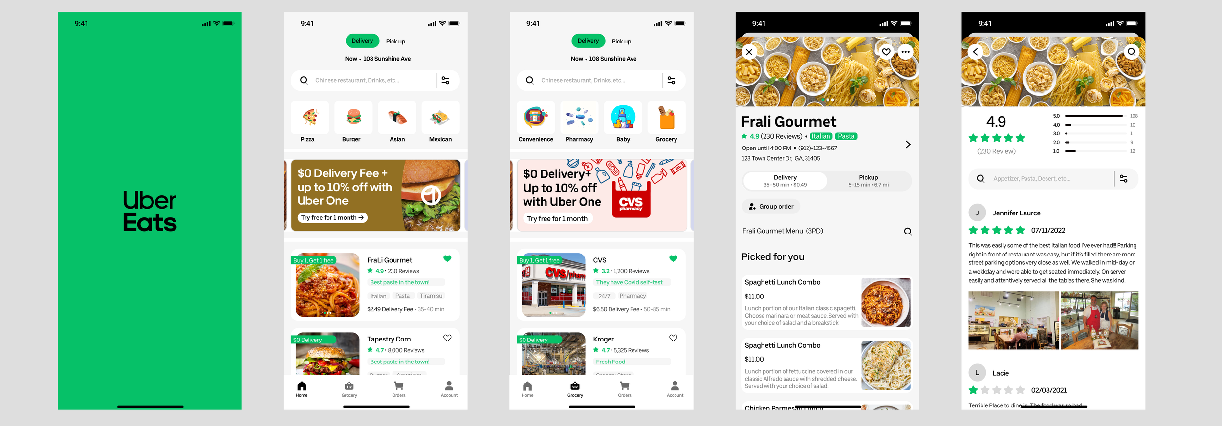
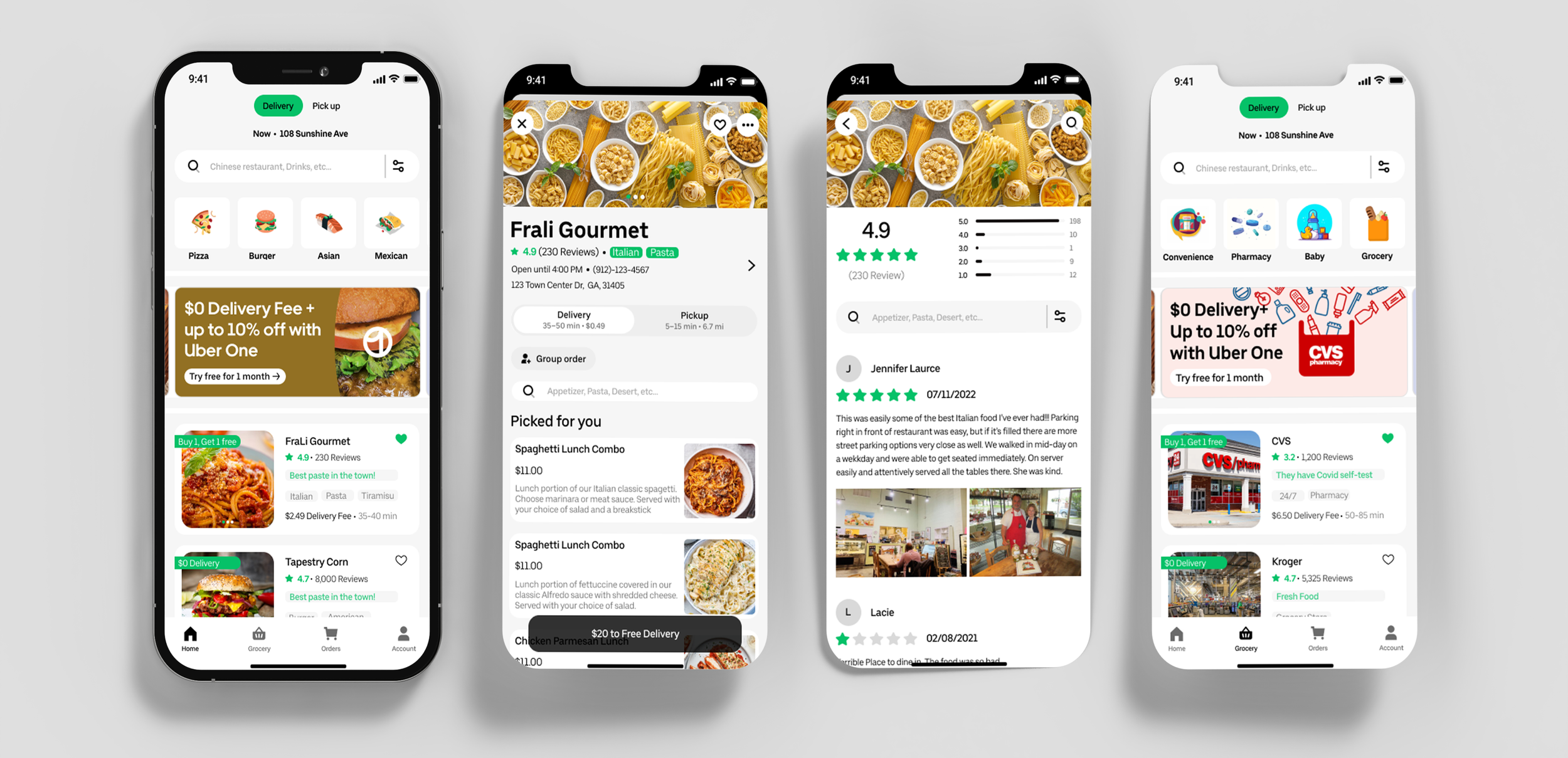
For a better understanding from the user’s perspective, I designed a welcome page, and a Home page, and separated the grocery feature into an individual page, a menu page, and a review page.
Usability Testing
Unmoderated remote usability testing
After I designed the interfaces, I applied Lab usability testing to test the functionality from the daily basics.
I sent the link to the interactive prototype to some people who had never used Uber Eats before to use a decent amount of Uber Eats.
Testing Task
I gave the users some tasks while they were using the new Interfaces.
- Find more information about Frali Gourmet restaurant.
- Find Frali Gourmet belongs which types of food.
- Find and read the reviews/ratings of Frali Gourmet
- Find the grocery shopping page.
Usability testing Result
Overall, it is a very successful interface design for the users, they all did the tasks perfectly, and they didn’t have major problems with the design. However, there is some detailed feedback from the users.
Testing Feedback
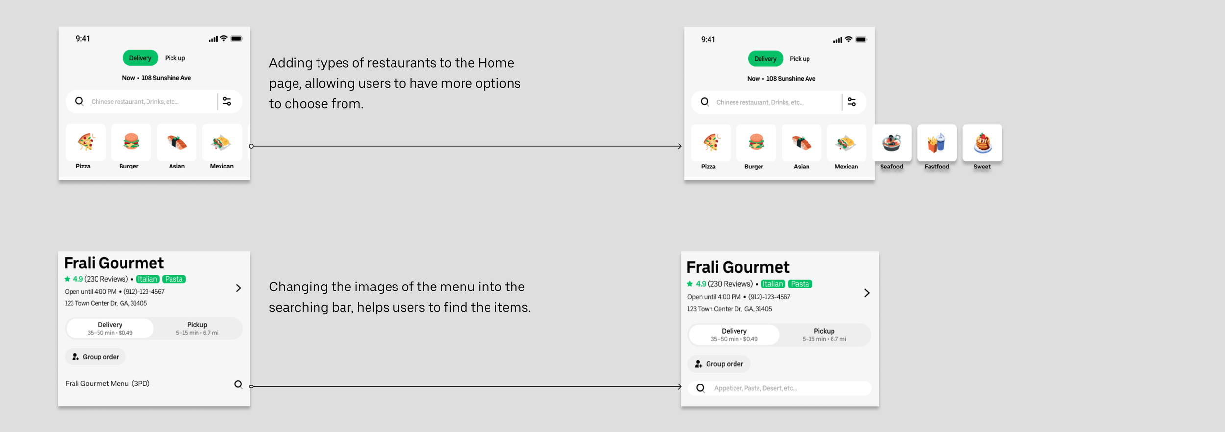
There are some bullet points I summarized from testing feedback
Adding more restaurant classifications to the home page
Adding a dish searching bar instead of pictures of a menu
Revisions
Solution
Takeaways
Learnings
- Even if upgrading the existing app was a huge challenge, considering the interaction between the users based on the current platform, it is a very positive way to understand the market and the opportunities. It will help me understand the users' problems and desires.
- Getting insights from users’ data would be a huge help. I didn’t have much chance to design as an end-user, so it was a great time to explore the pain points myself. When I did the interviews, the interviewee gave me many more insights.
Next Steps
- Gaining more data from the user who comes from a wide background, to analyze the design from more perspectives would help the final design be more empathetic.
- Finishing the rest of the interactive prototyping, considering the technological breakthrough. Communicating with the developers and marketing co-works to push the solution into a better solution.
